Every tool I used to read Markdown was built for writing
In the past I’ve used markdown mostly for personal note writing, never really needing to re-read much or share what I wrote with others. As I started using AI tools, I realized much of my workflow was now centered around reading and verifying Markdown files. I’d open them in VS Code or iA Writer because that’s what was available, but those tools were full of writing features I didn’t need. Most of my Markdown became reading and verifying, not writing or editing, and I imagined that others might be facing a similar change in their workflows.
macOS has no native way to render Markdown. Quick Look shows the raw source. The existing options are code editors, writing tools, or browser-based viewers with privacy tradeoffs.
AI inverted the Markdown use case
Markdown tools assumed you’re the writer. AI changed that. Most .md files I touch arrive from someone else, and I just want to read them. The tools still assume I want to edit.
As more people start receiving AI-generated Markdown, the need for writing diminishes while the need for reading and verifying increases.
Reading the room before writing the code
I started with desk research. I collected 25 sources across Apple Community forums, OpenAI support threads, Hacker News, Reddit, and developer blogs, then mapped each one by date, severity, and what it revealed about the problem.
The same friction kept coming up. AI tools output Markdown by default, and the people receiving those files often don’t have a good way to read them. I tracked a severity gradient across segments.
- Mild inconvenienceOccasional recipient
Someone who gets a
.mdfile once in a while. They figure it out, maybe paste it into a browser preview, and move on. Not a blocker — but not a good experience either. - Real frictionKnowledge worker
Designers, PMs, and writers pulling down AI-generated Markdown weekly. They need the content in an email, a deck, a Doc. Every workflow has a manual reformat step that adds up fast.
- Full blockerCross-functional team
Obsidian users sharing notes with colleagues who don’t use Obsidian. The format barrier is the core problem. The recipients can’t read the file without installing a tool they don’t want.
Then a short survey. Every active Markdown user listed AI tools as a source of .md files. 80% said copying formatted text into email, Docs, or Slack was their most-wanted feature. The most common workaround was asking the sender to convert to PDF. Nobody asked for editing.
The survey skewed technical, so the findings are directional. I’d need a broader sample for stronger conclusions. But the signal was clear enough. Copy-as-rich-text was the headline request. Editing wasn’t.
- Apple Community · Forum · 2022
- High
”Pages cannot open Markdown, nor even consume plain text, and magically transform it into styled content.” Workaround: pandoc on the command line.
- AIPRM Forum · Community · Aug 2024
- High
A user wants “an easy way to view, print and edit MD markup files exported by ChatGPT” because the raw file doesn’t match what they saw on screen.
- OpenAI Community · Forum · Sep 2024
- High
”ChatGPT consistently delivers responses in Markdown, which is problematic because I use the generated text in a word processor for legal purposes.” Prompt engineering didn’t help.
- Hacker News · Show HN · Feb 2026
- High
A developer shipped a Markdown viewer because “macOS would open Xcode when cmd-clicking into newly created markdown files, which was slow and lacked native rendered viewing.”
- Daring Fireball · Blog · Jun 2025
- Market signal
John Gruber on iOS 26’s Markdown import/export in Notes: “Markdown export from Notes? That sounds awesome.” Apple’s first-party validation that Markdown has gone mainstream.
Everybody’s building the same thing
I audited 13 direct competitors and 8 indirect ones (workarounds like VS Code, GitHub rendering, pandoc, and browser-based viewers), then mapped them on two axes: reading vs. writing, simple vs. powerful.
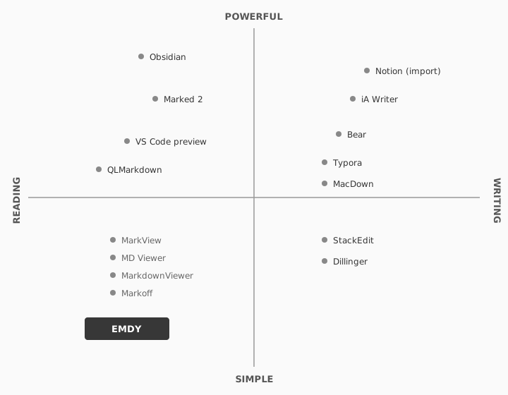
The established apps (Typora at $15, iA Writer at $50, Obsidian with a subscription) all target writers. They handle Markdown rendering well, but they come with an editor’s UI that’s unnecessary if you only want to read a file Claude generated for you.
Marked 2 was the closest established competitor, but it’s designed as a live-preview companion for writers editing in another app. MarkView was the most conceptually similar: a free, cross-platform viewer, largely unmaintained.
Discoverability was the other gap. Most people don’t search for a “Markdown reader” when they get a .md file. They ask the sender to convert to PDF, or they paste the content into a browser tool. The product challenge and the distribution challenge were the same size.
Committing to scope
The obvious product here is “Markdown editor, but better.” That quadrant is crowded and I’d lose on day one.
I defined Emdy by what it wouldn’t be. No editing. No recursive directories. Every feature added for writers would dilute the reader experience.
Holding this line became the single design principle I returned to whenever “but what if we also…” pressure showed up later.
Emdy’s design principles
Once the scope was defined by what Emdy wouldn’t be, I wrote down the rules that would hold that line. They came out of the design brief and survived every feature debate after.
01 · Reading is the entire product
Every decision filtered through one question: does this make reading a Markdown file better? If the answer was no, it was out of scope.
02 · Non-technical people should never feel lost
No preferences screen with thirty options. No terminal commands. No jargon. A marketing manager who has never heard of Markdown should be able to double-click a .md file and read it.
03 · Respect user privacy
Emdy runs entirely on the user’s machine. No feature tracking, no analytics, no required registration, no personal information collected. The only network call the app makes is checking for updates.
Designing the moment someone double-clicks a .md file
I mapped four journeys. The primary one: a non-technical person receives a .md file from a developer or an AI-generated export, and wants to read it without installing another editor. They don’t search for a reader. They discover Emdy through the person who sent them the file.
- 01 · Generated
Claude returns a plan, a doc, or a summary as a
.mdfile. - 02 · Confusion
Open the file. TextEdit shows raw
#and**syntax. - 03 · Discover
Developer recommendation or search leads them to Emdy.
- 04 · First open
Double-click. The document renders as a document.
Pain → Resolved
That single insight shaped the distribution strategy around developer word-of-mouth. If developers know Emdy exists, they can recommend it. Non-technical users come in the side door.
The highest-friction journey was first-install. macOS Gatekeeper can block unsigned apps on first launch, which is why code signing and notarization were non-negotiable despite the cost. Setting Emdy as the default .md handler is still a manual step through Finder, which means there’s real drop-off risk between “installed” and “integrated.”
Designing the failure modes
I mapped the full service across three layers: what the user sees, what the app does behind the scenes, and what macOS provides. Charting them together surfaced every moment where the experience could break and made the recovery behavior explicit.
Service blueprint for the primary journey, across three layers.
- Frontstage What the user sees
- File open Double-click on a
.mdfile - Read Window appears
- Render Document renders as a document
- Display Scrolls, adjusts font, zooms
- Interact Copy as rich text, print, save as PDF
- Backstage What Emdy does
- File open Receives file URL via app delegate
- Read Reads raw Markdown from disk
- Render Parses GFM, builds attributed string
- Display Applies font, zoom, theme
- Interact RTF to pasteboard, prints attributed string
- Support macOS and libraries
- File open Launch Services, UTType registration
- Read File system I/O, sandbox
- Render cmark-gfm, URLSession for images
- Display Window manager, scroll physics
- Interact NSPasteboard, print subsystem
The most useful output was a failure mode inventory. Every way the app could break was documented (unreadable files, malformed Markdown, failed remote images, files deleted while open) with recovery behavior designed for each.
Render what you can, show what went wrong without blocking the user, and never lose what’s already on screen.
Defining visual direction
Visual direction had to carry across three surfaces: the app, the icon, and the marketing site.
App design
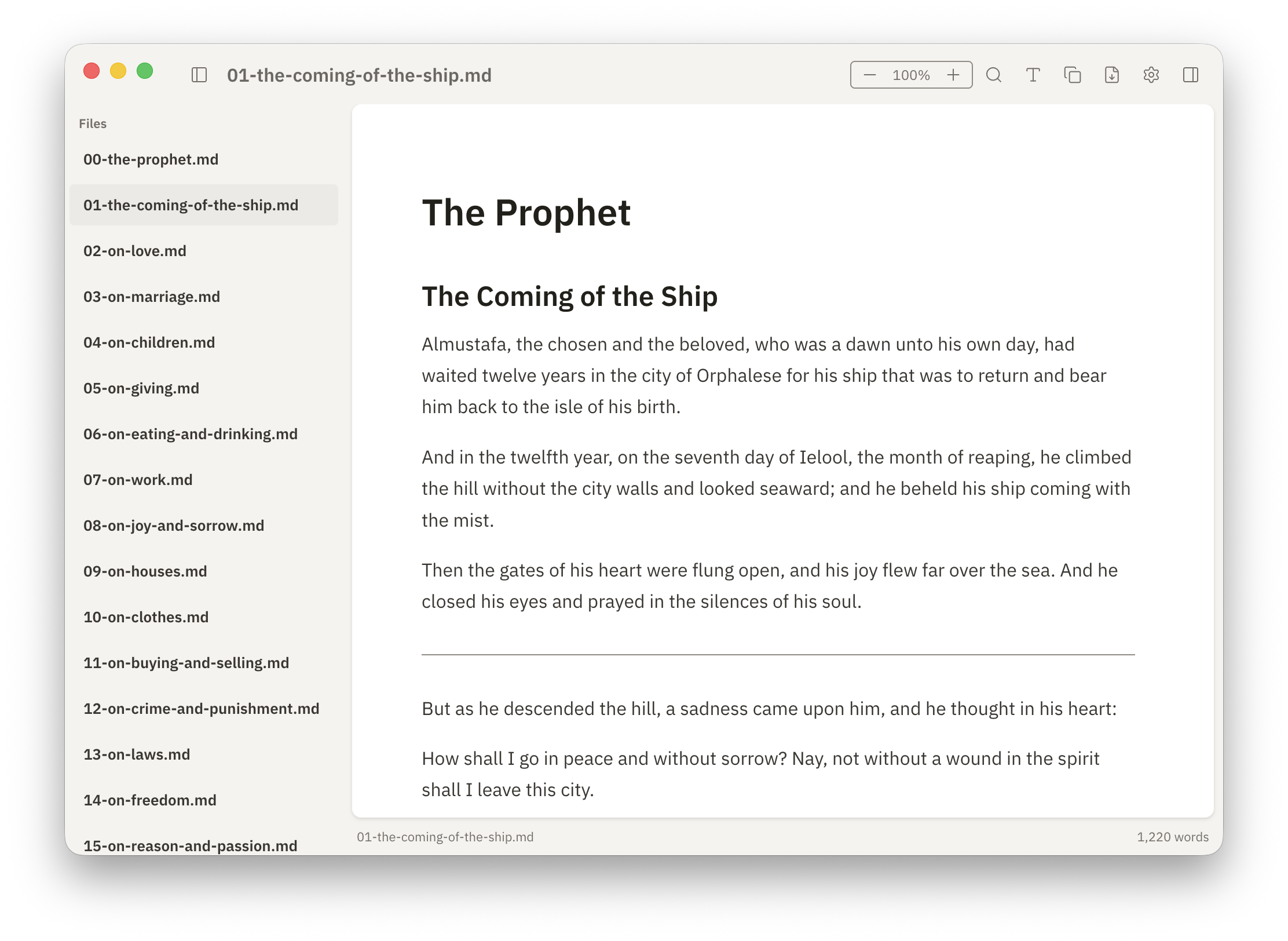
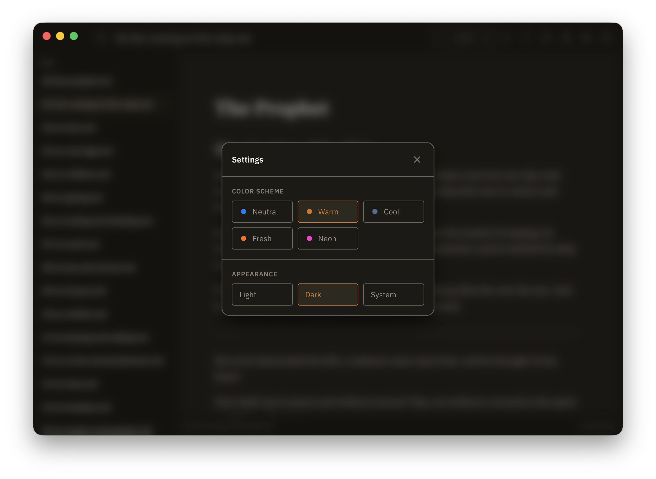
The app draws from Braun and Dieter Rams: utilitarian, quiet, tactile. The accent palette spans Warm, Cool, Neutral, Fresh, and Neon, with light and dark modes across all of them.
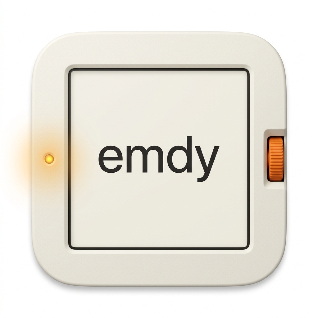
App icon
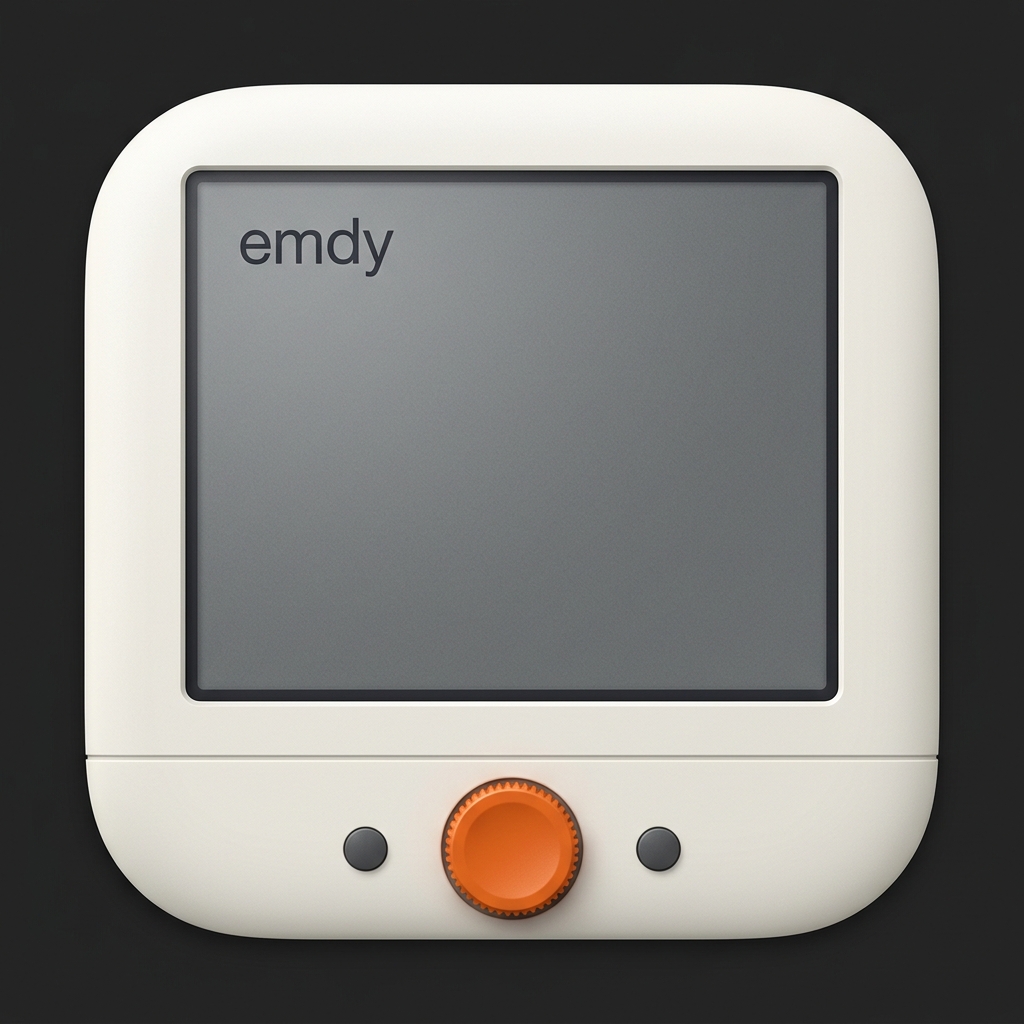
The icon went through several rounds. It started with direct Braun product references: a turntable, a clay letterform, a book stand. It moved through reader-device and retro-monitor concepts. Through roughly ten iterations, the mark got simpler and more confident.





Marketing site
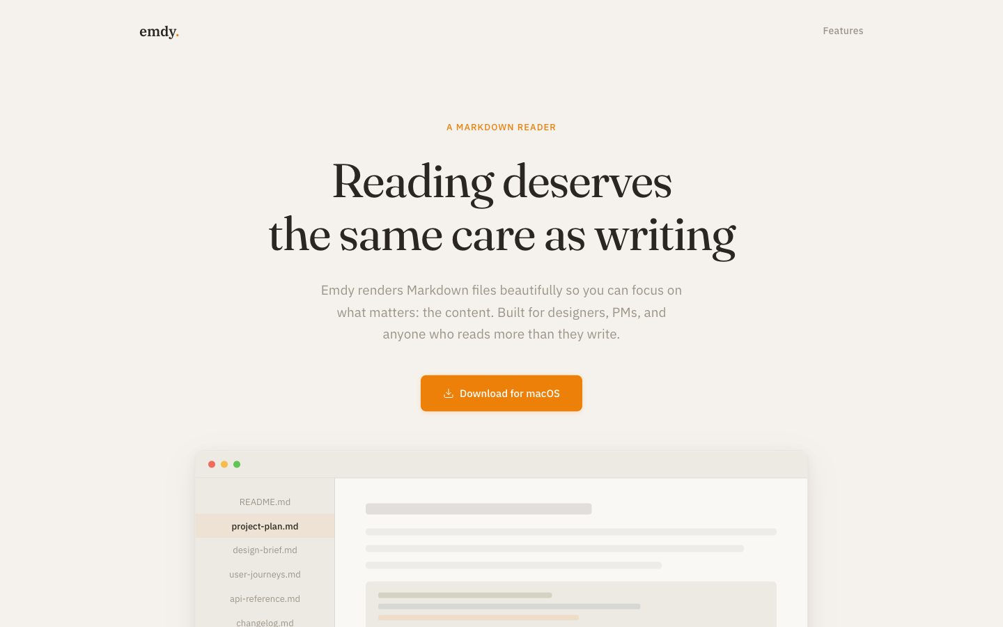
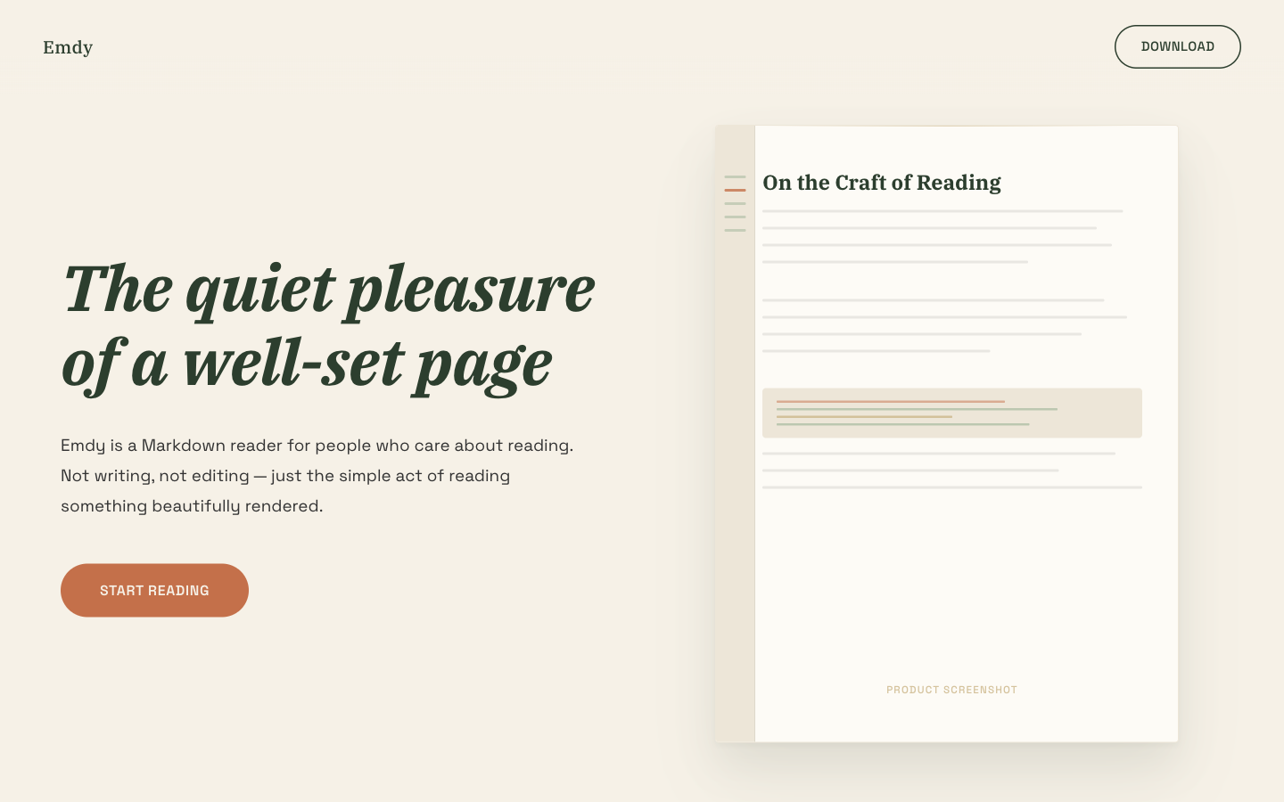
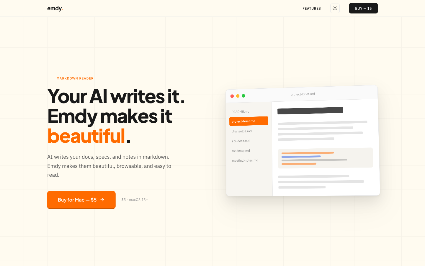
I explored nine marketing-site directions before settling. Most tried to explain too much. The one that worked showed a before-and-after comparison of raw Markdown and rendered output, communicating the value in a single scroll.
Three of the early explorations:
Six layers of accessibility
A six-layer specification targeting WCAG 2.1 AA conformance:
- Semantic landmarks with skip navigation and proper
navandmainregions. - ARIA roles and labels on every icon button, modals as dialogs, the command palette as a combobox with a listbox, settings as radiogroups, the sidebar with
aria-current. - Focus indicators with visible
:focus-visiblerings, suppressed on mouse interaction. - Focus trapping in modals with Tab/Shift+Tab cycling and focus restoration on close.
- Live regions announcing search results, zoom changes, file loads, and errors.
- Reduced motion and contrast, respecting
prefers-reduced-motionand verifying WCAG AA contrast across every color token.
The test was whether the app could be used well without a mouse, read aloud in sequence by a screen reader, and stay polite under prefers-reduced-motion.
Free, open-source, pay-what-you-want
Emdy is released under GPLv3. No paywall, no gating, no trial. The app is free to download and use indefinitely.
Emdy is a utility. Asking someone to create an account or enter payment details before they can read a document felt like the wrong tradeoff. Revenue depends on volume and goodwill.
Distribution is outside the App Store. Developer word-of-mouth is the channel. Non-technical users don’t search for a reader. They ask the person who sent them the file. If developers know about Emdy, they can recommend it.
What shipped
Emdy is a free, open-source macOS app. You double-click a .md file and it opens. You can read it. You can copy it out as rich text. You can pay what you want, or nothing.
A lot of the design work was deciding what not to ship. No editing. No recursive directory trees. No account, no tracking, no App Store listing. Every one of those features was reasonable on its own. Each would have moved the product toward the editor category, where it had no advantage. The hardest part of this project was holding the line.
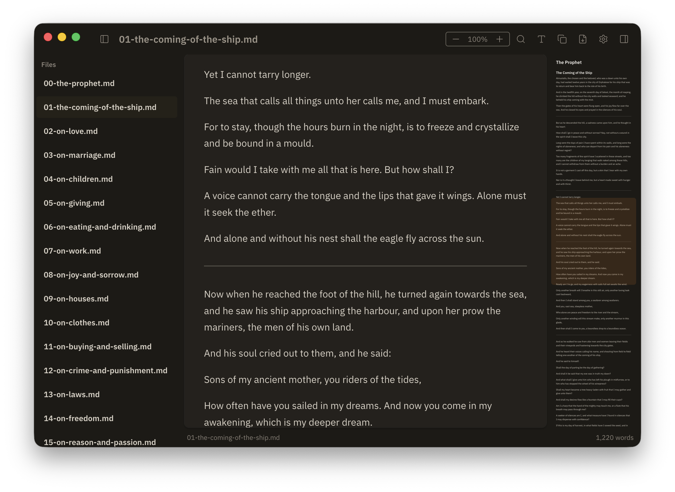
What I took away from this work
Scope is the hardest design decision. Every feature request is reasonable in isolation. Recursive directories. Markdown editing. HTML export. Each moves the product away from its original intent. The hardest work was deciding what to leave out.
The framework didn’t decide the quality. The Swift-to-Electron pivot felt like a big deal at the time. Looking back, Emdy’s quality came from the design system and the detail work. Either stack could have shipped this app.
Research saved time. The desk research and short survey took a few days. They steered me away from building an editor (nobody wanted one) and confirmed that copy-as-rich-text was worth prioritizing.
I underestimated engineers as an audience. After release, a lot of the usage came from developers. I hadn’t prioritized them in the research because I assumed they’d open .md files in their IDE. It turned out they preferred a dedicated reader, which fits in hindsight. They get more Markdown than anyone.