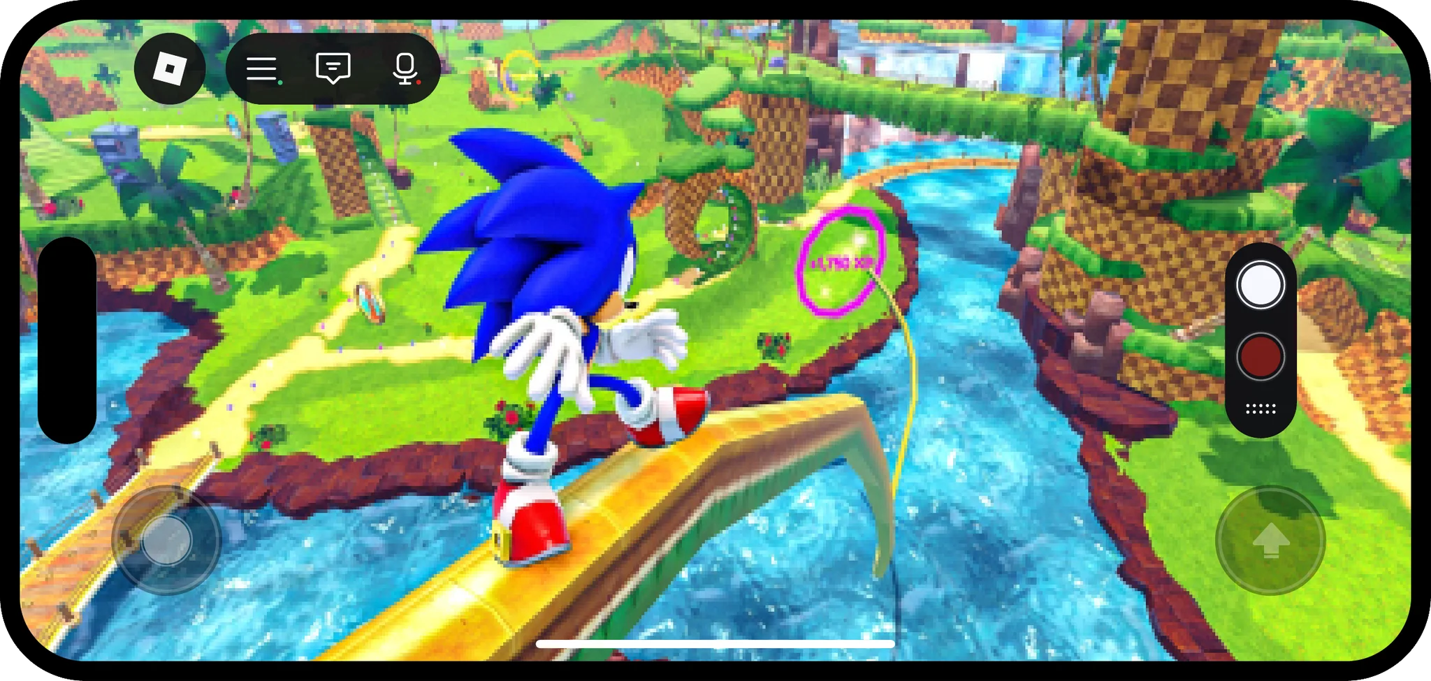
Finding capture was one of the biggest barriers to Moments adoption
We learned it in the initial launch of Moments, where 800 TestPilots helped us stress test the experience. Screen capture is a critical step in Moments creation.
We mapped the steps from playing an experience to posting a Moment
Most of the steps needed more awareness, less friction, or both.
- Play an experience where Moments are enabled (awareness)
- Consume Moments (awareness)
- Enable captures (awareness, reduce friction)
- Capture a video (reduce friction)
- Create a Moment (awareness, reduce friction)
- Give the developer permission to access the gallery (reduce friction)
- Edit and post a Moment
Users thought the video capture icon was a coffee cup
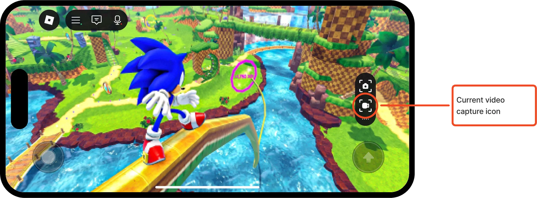
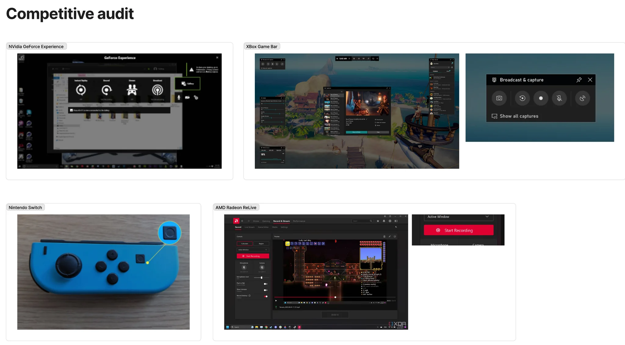
Capture buttons elsewhere are abstract
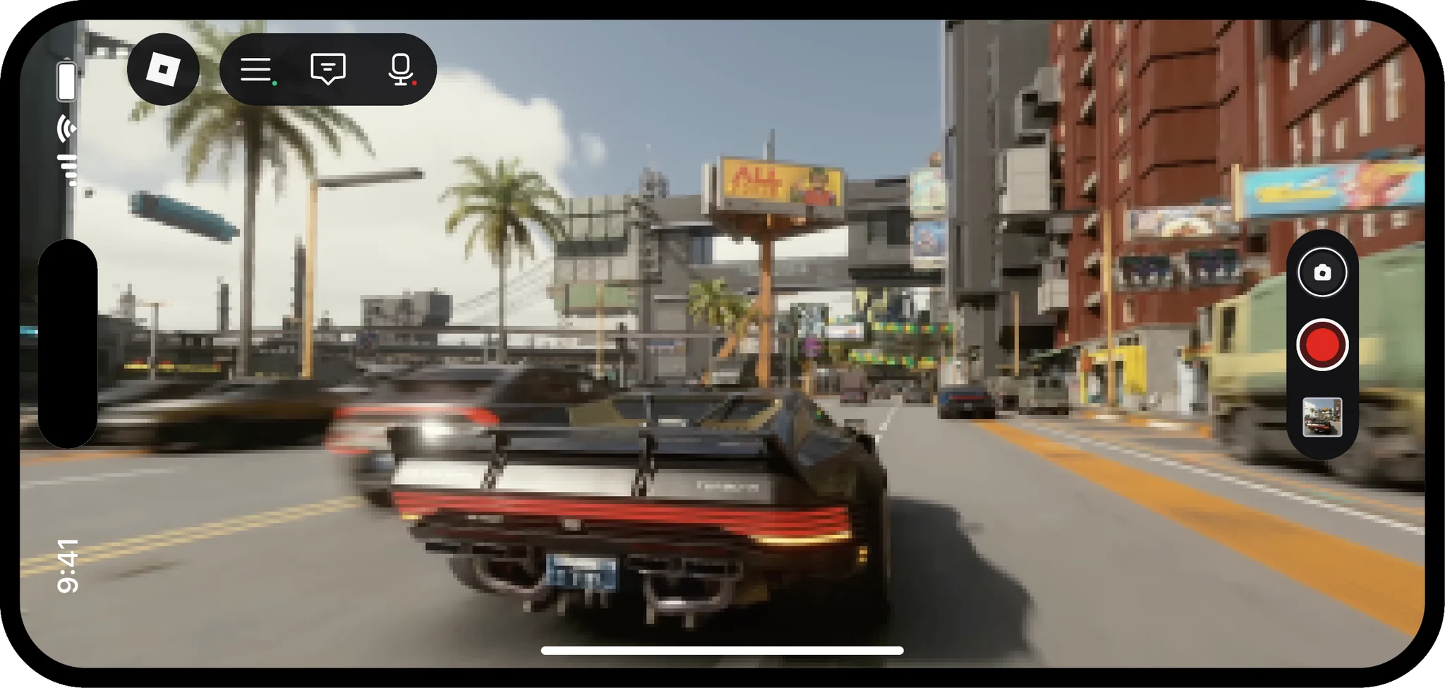
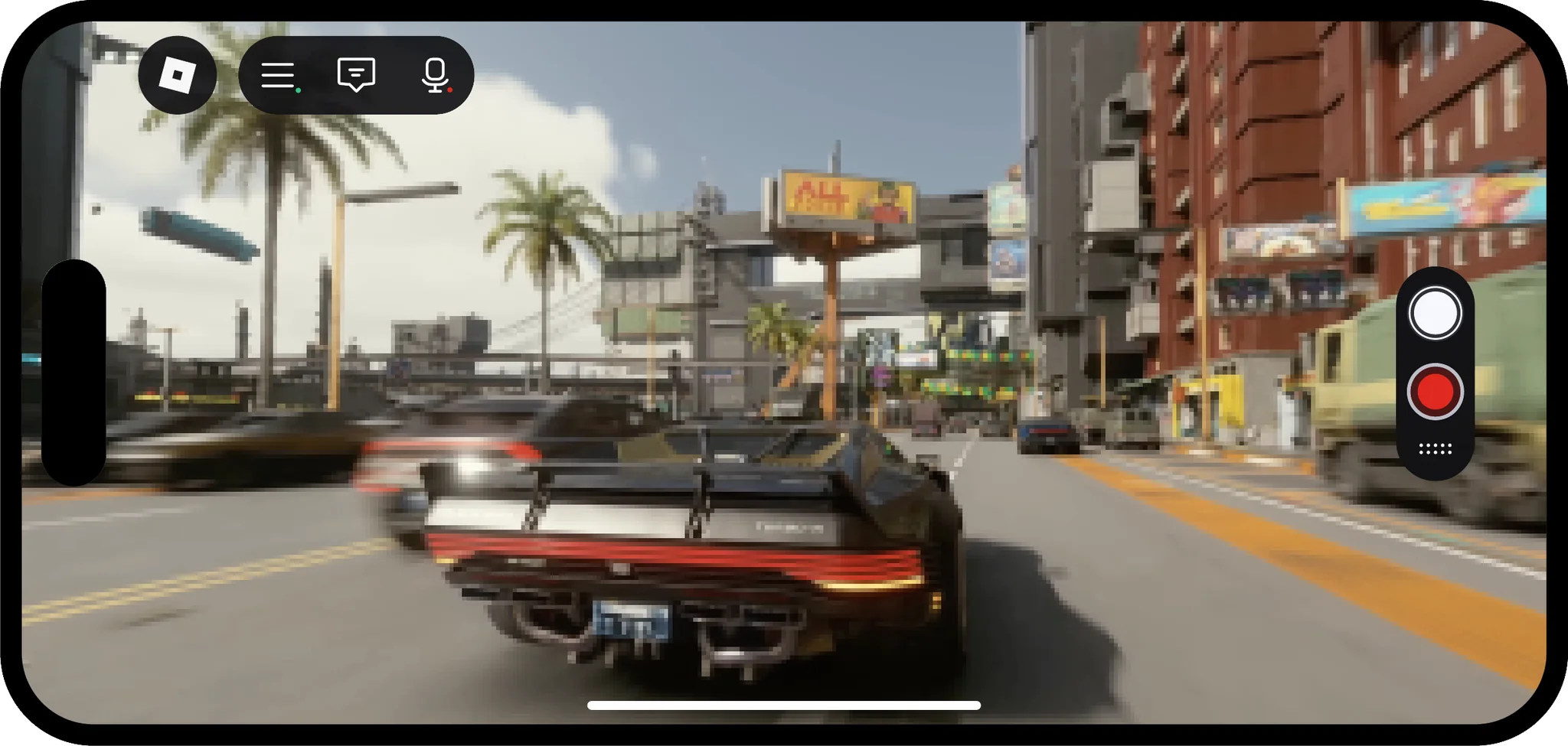
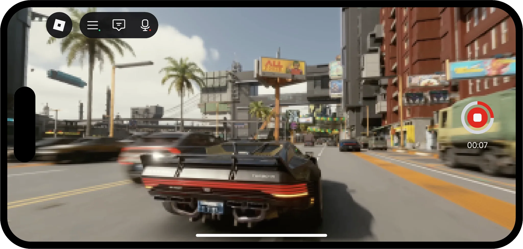
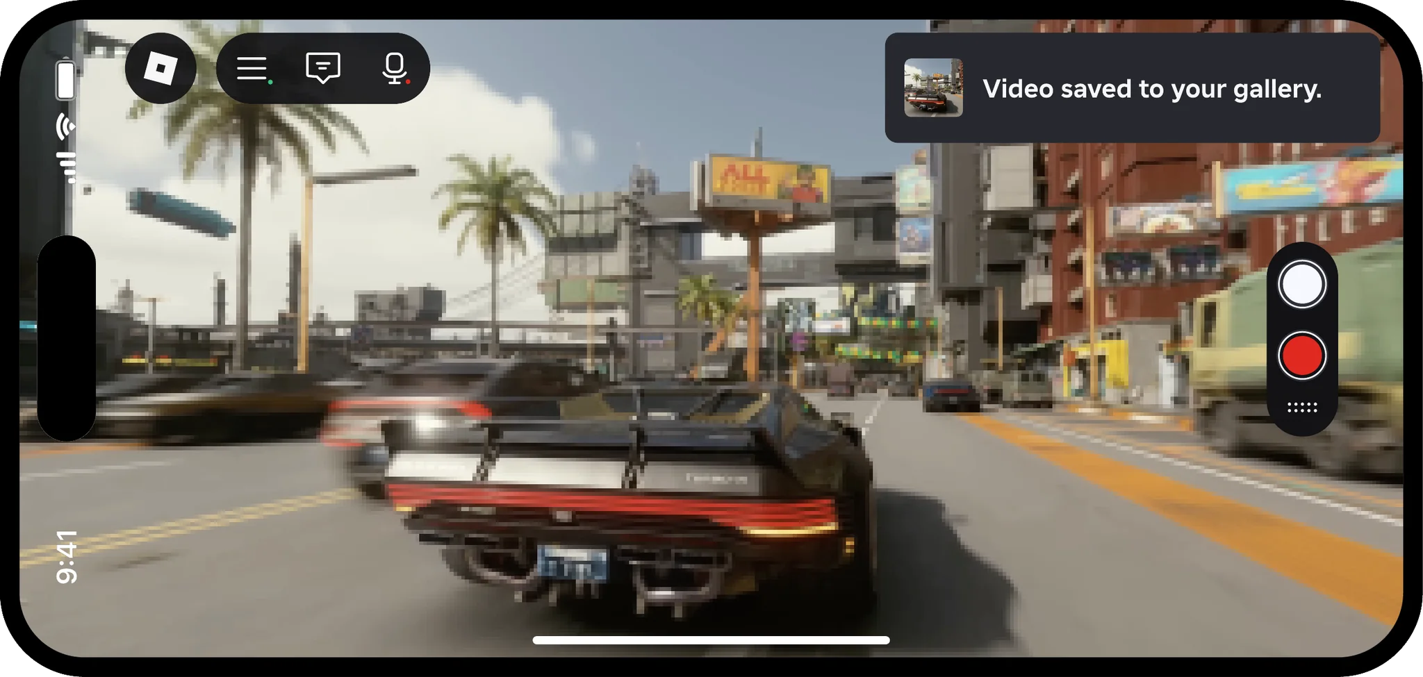
The figurative approach was inconsistent with what users expect. We audited a variety of capture tool UIs as well as mobile camera app UIs, and a more abstract, modern treatment is the established visual language for capture buttons.

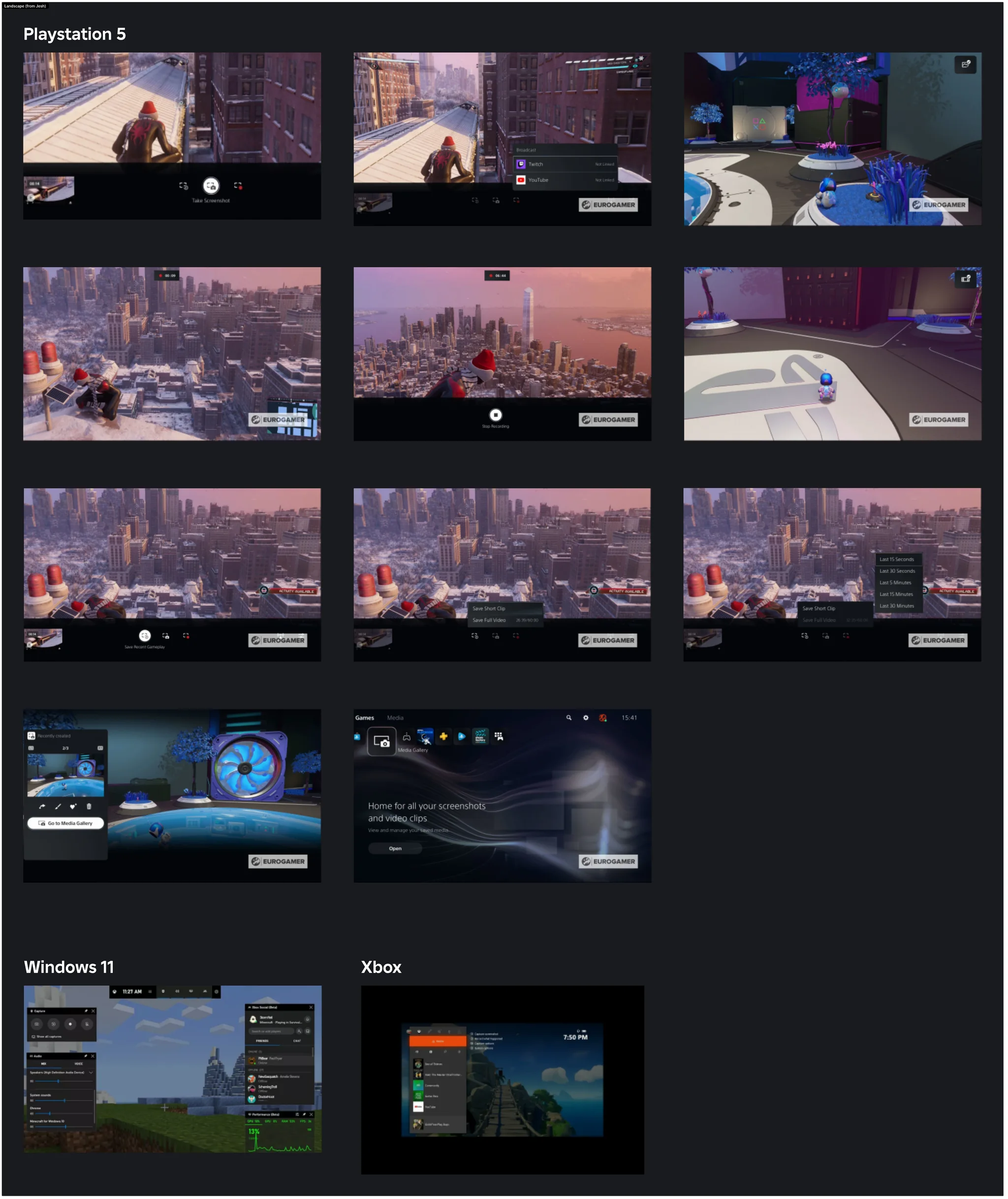
New capture buttons
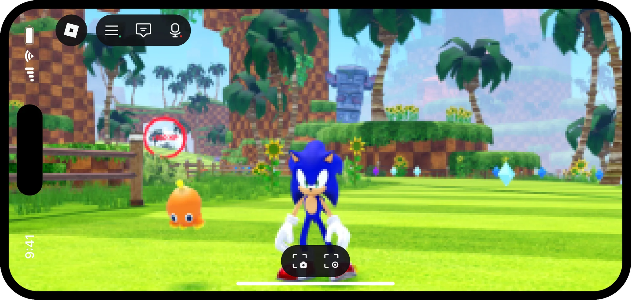
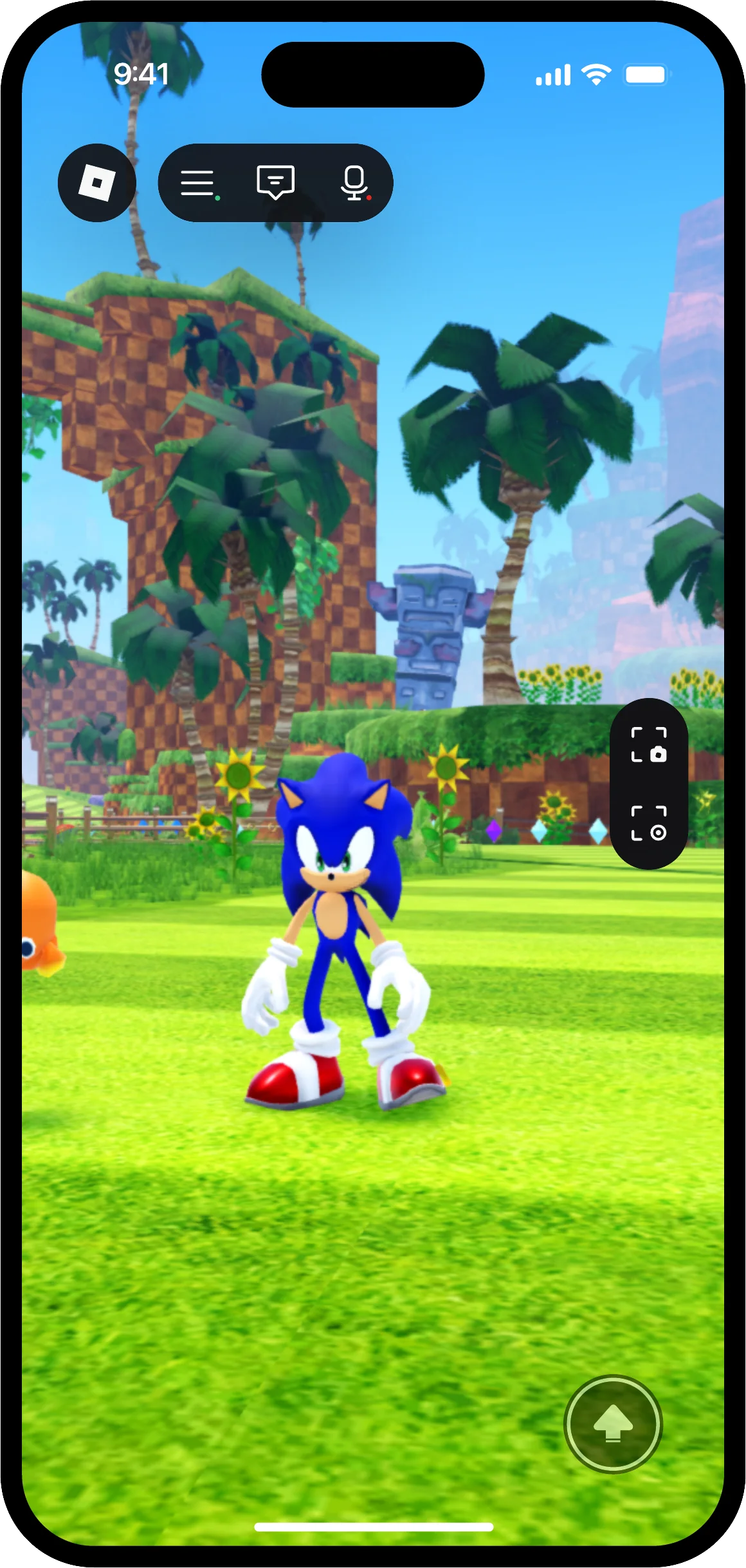
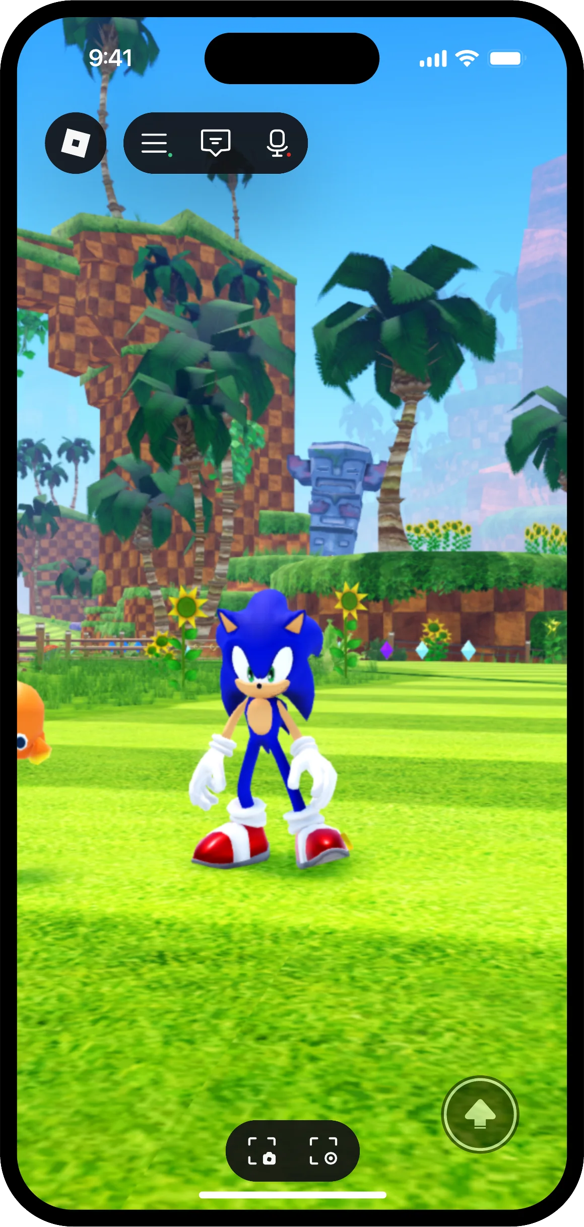
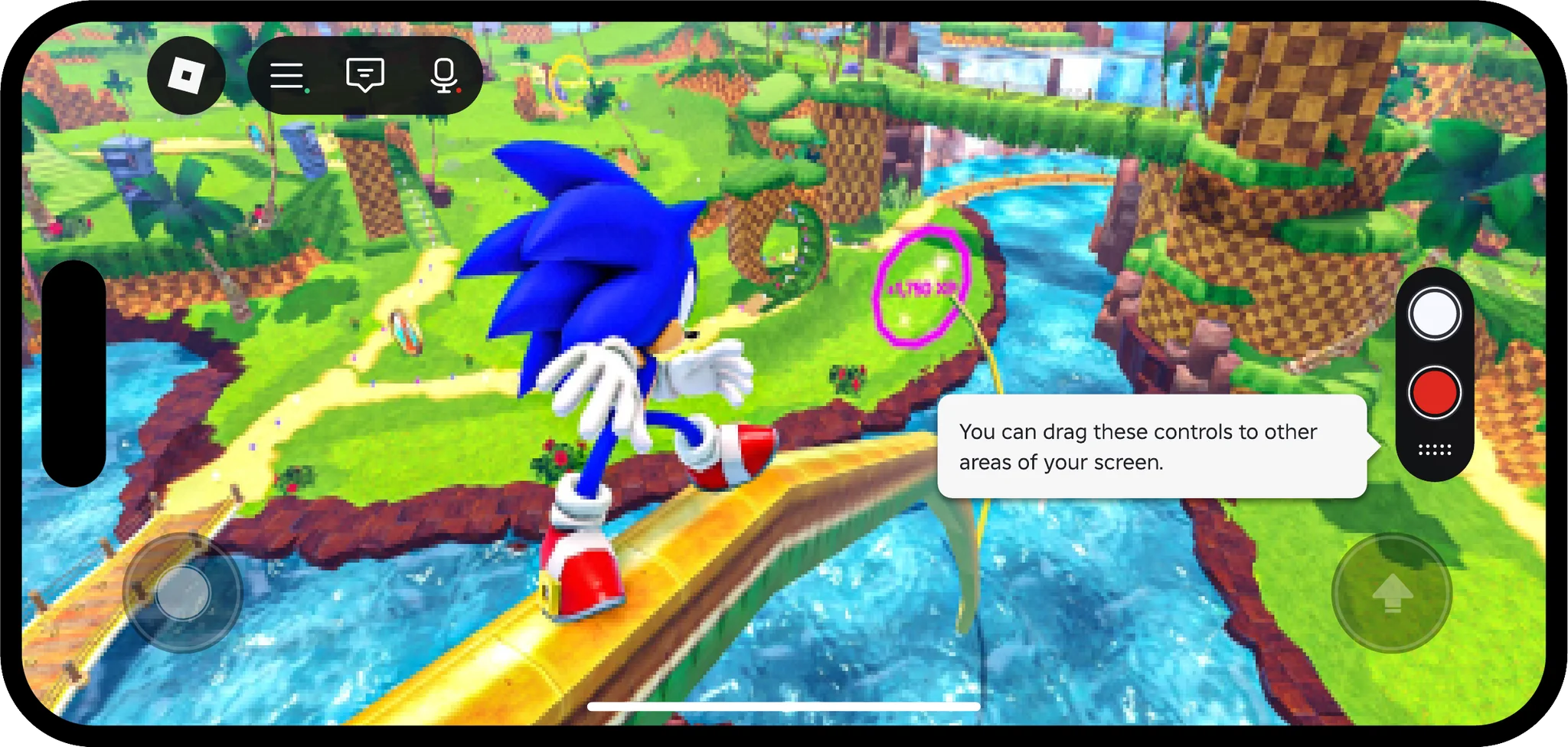
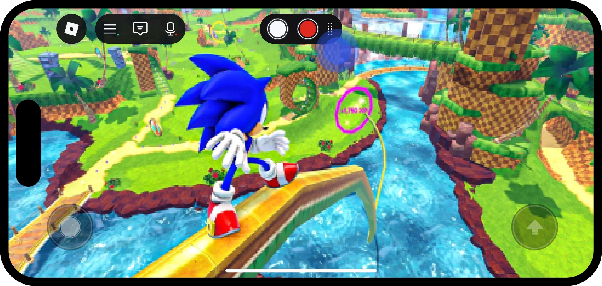
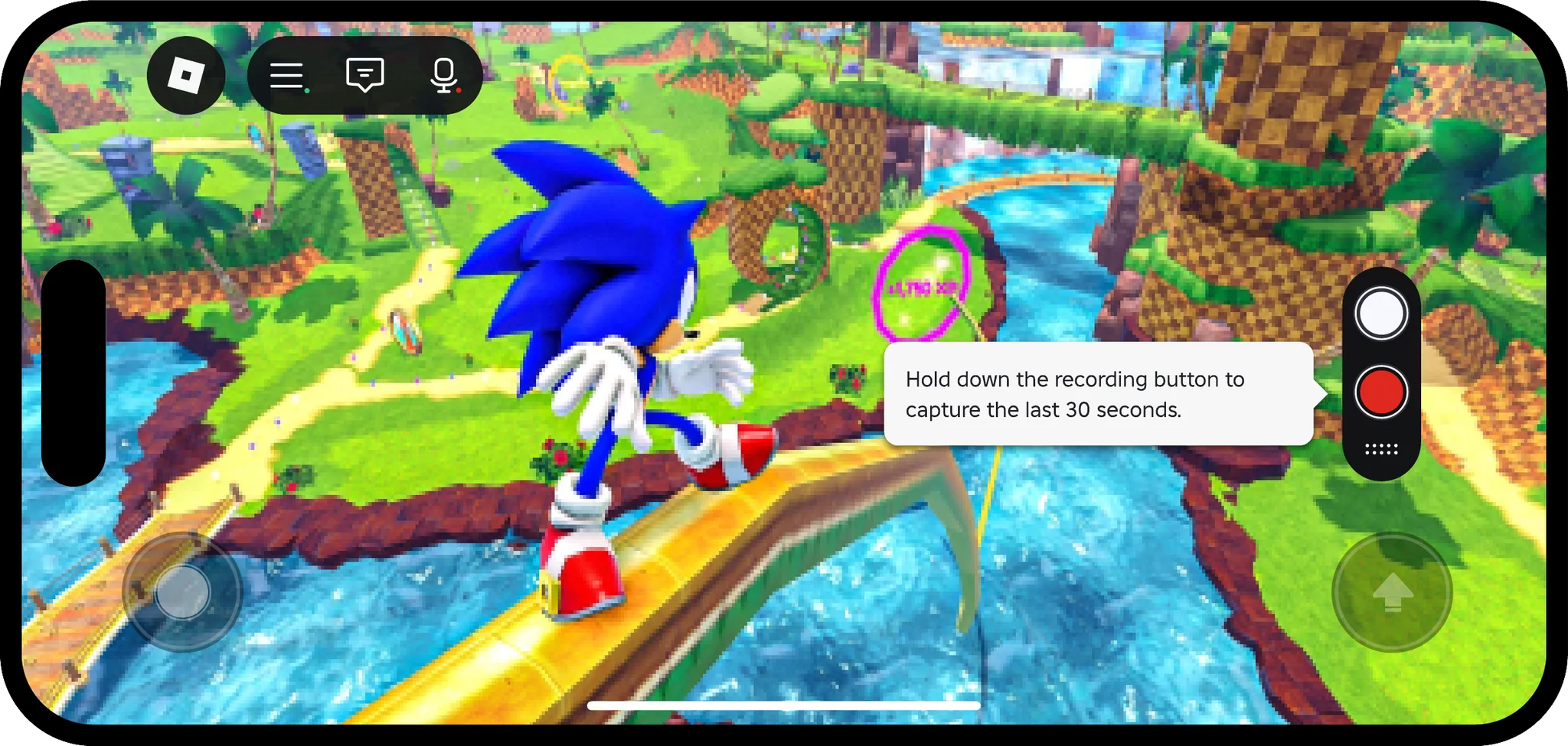
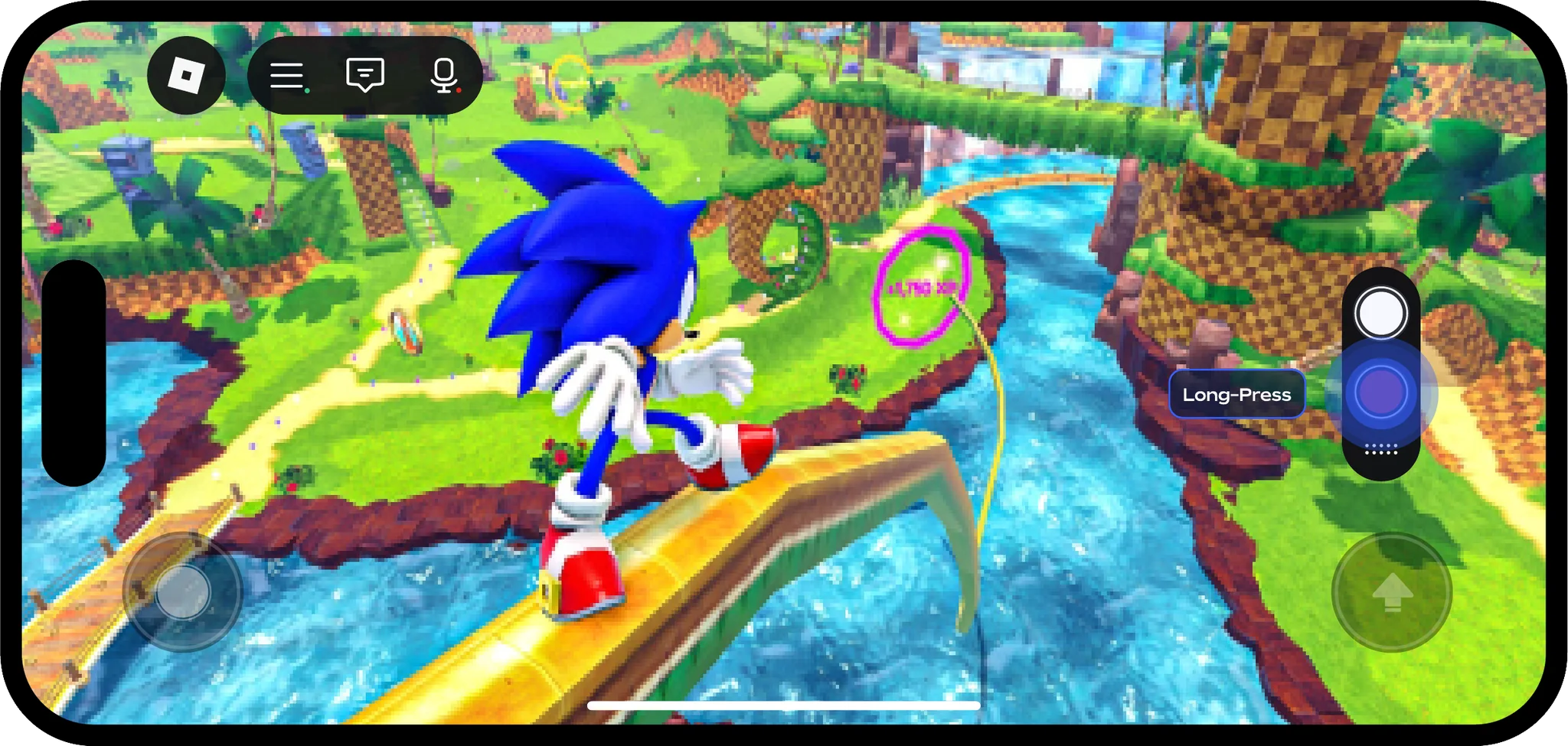
We explored abstract buttons for photo and video, and how they look while recording and once a video is saved.
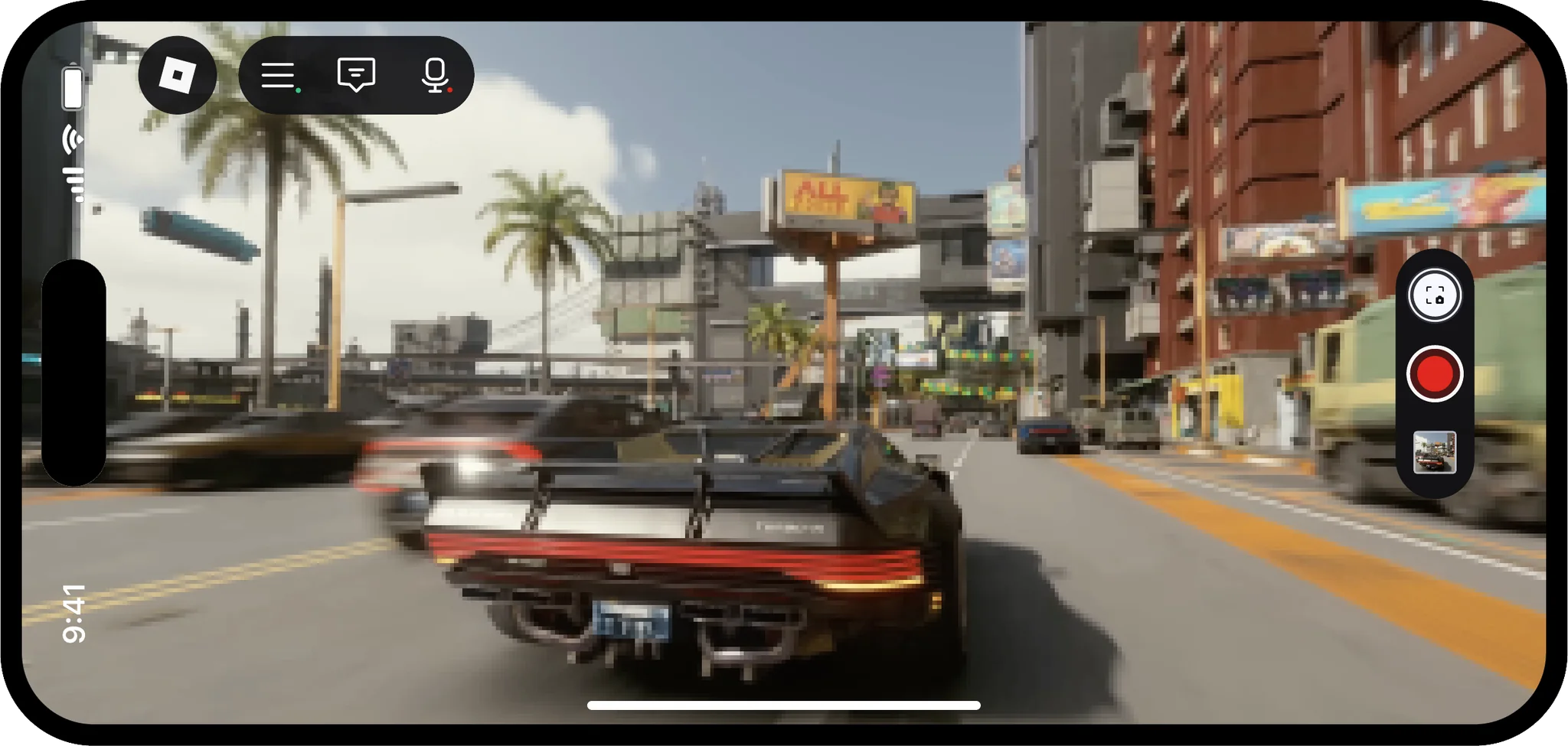
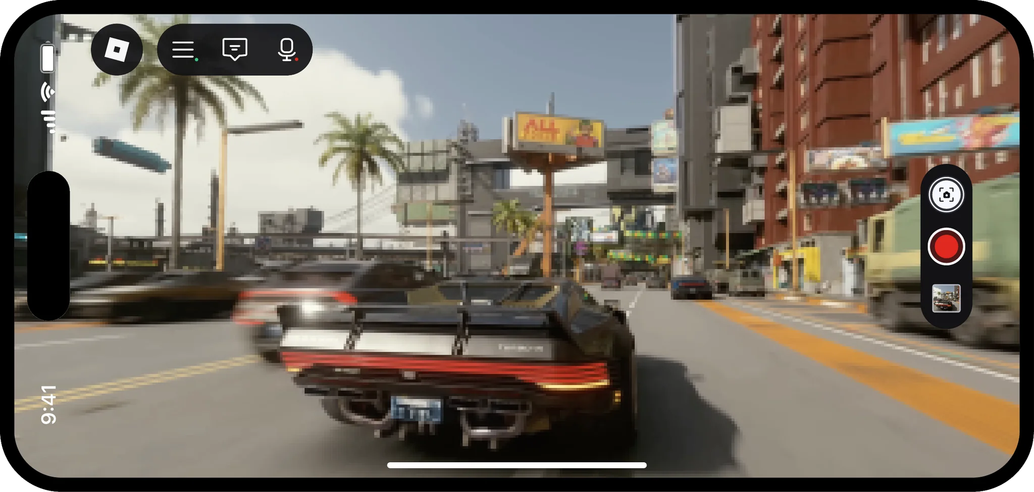
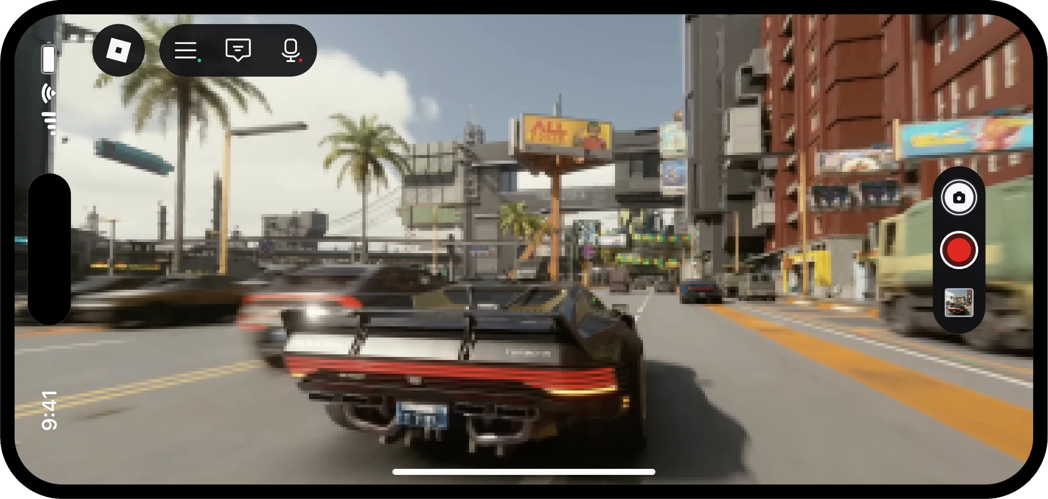
Where the buttons sit
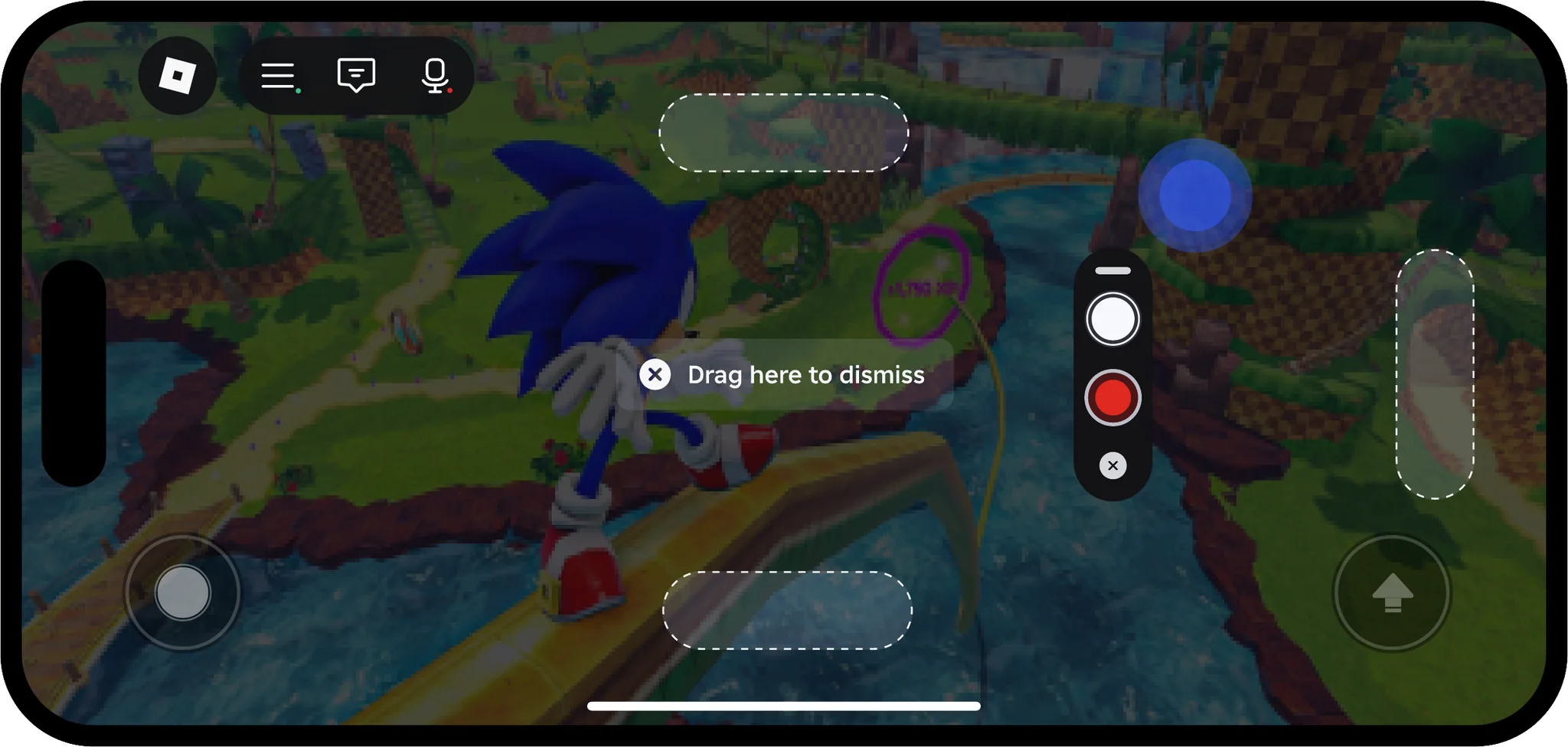
We tried the buttons along the right edge and along the bottom, in landscape and portrait, and designed a way to drag them to other areas of the screen, with a tip that says so.
Teaching capture
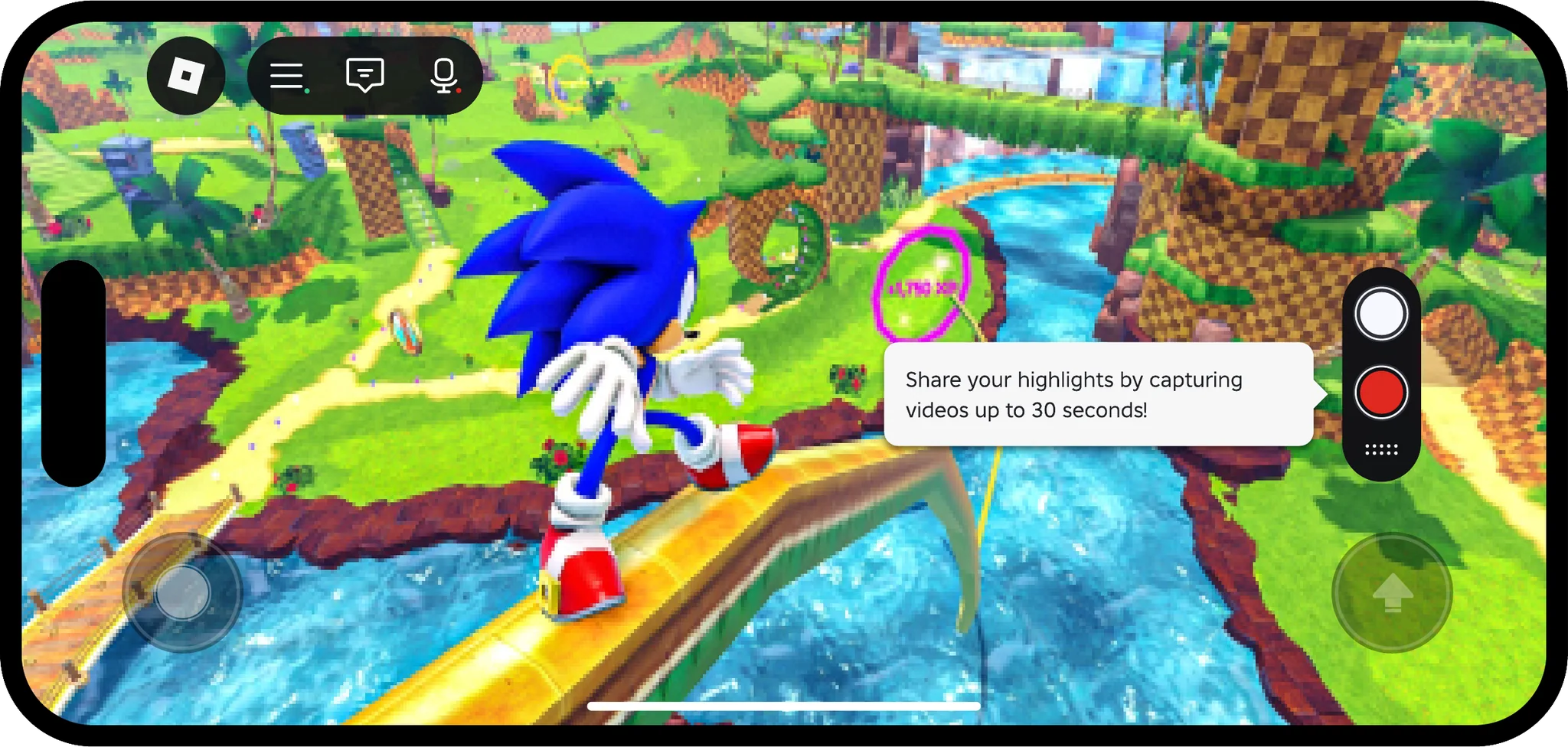
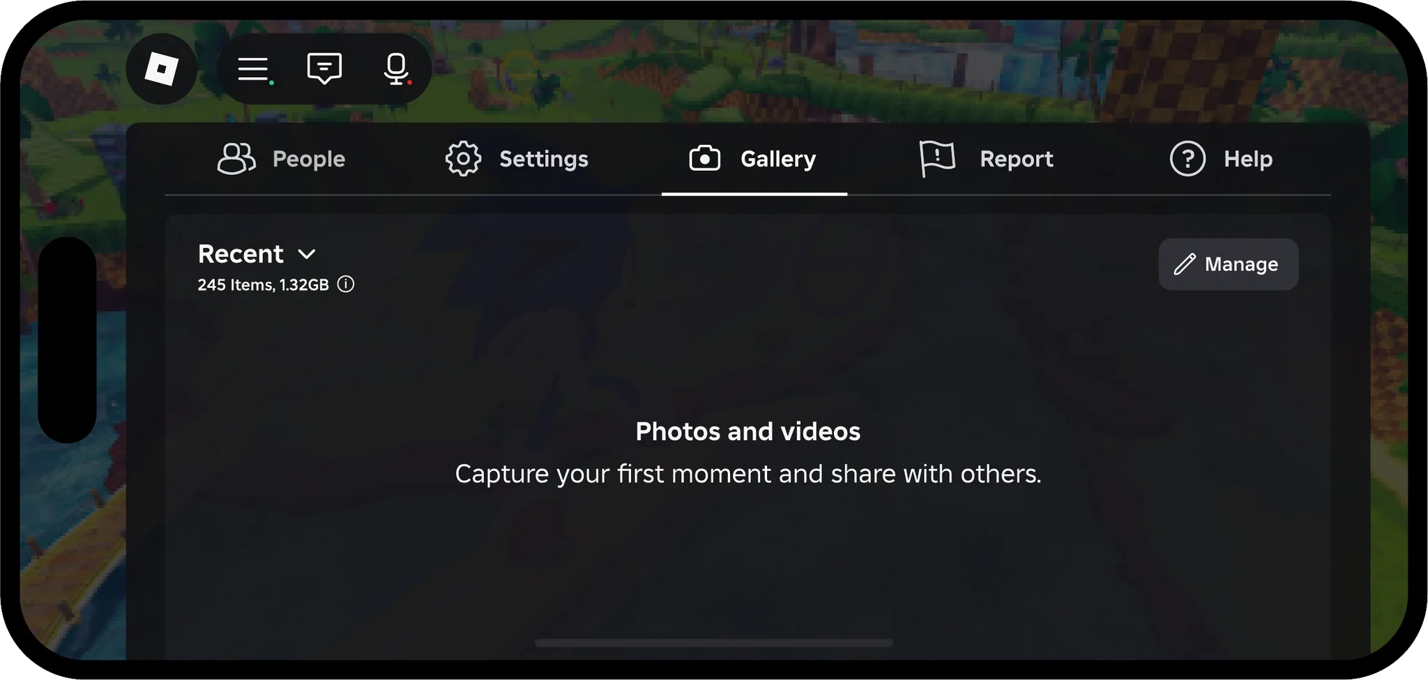
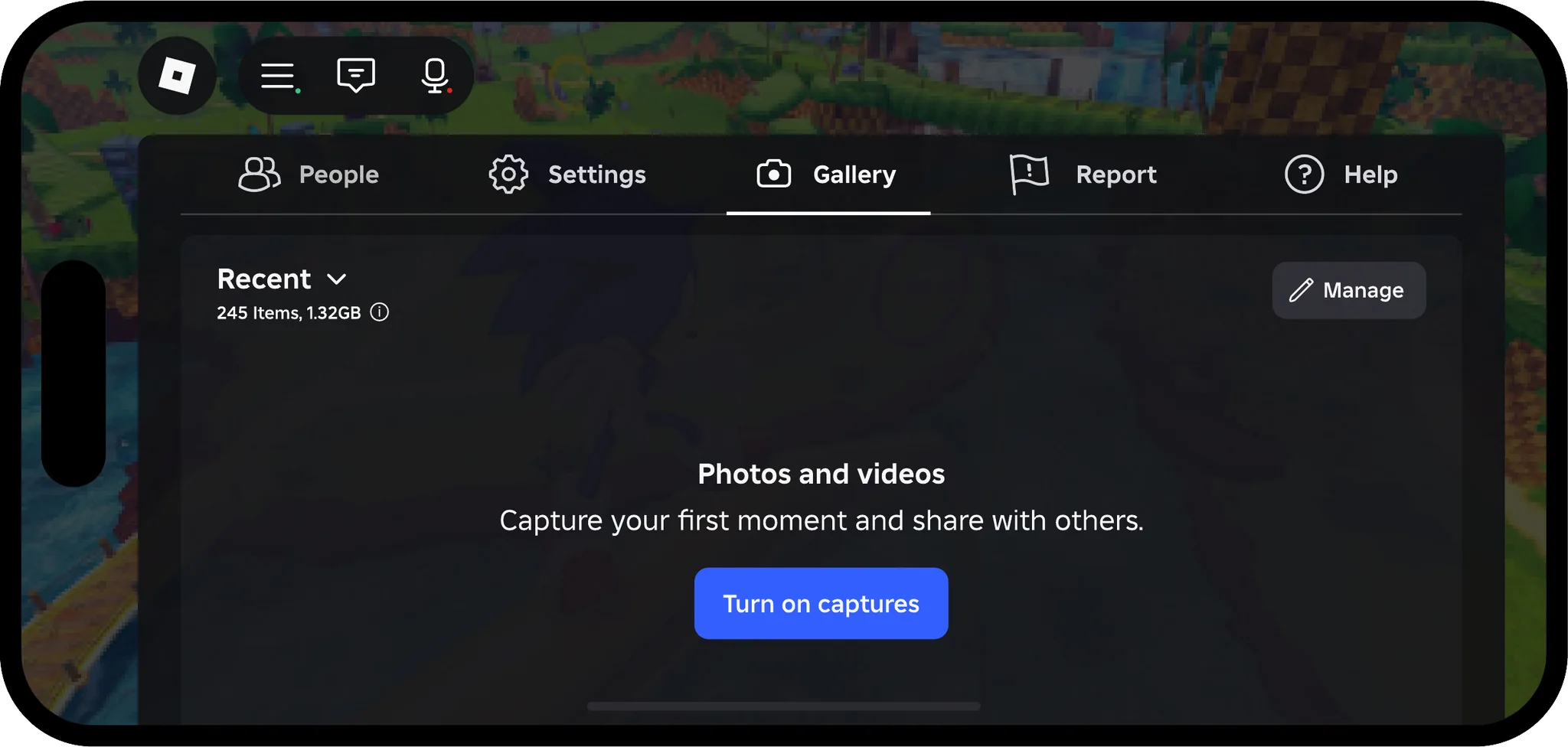
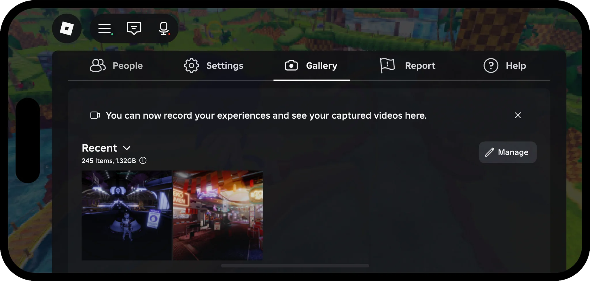
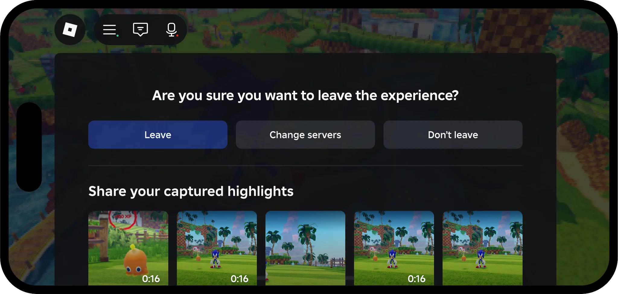
We designed a tip for the first time the buttons appear, empty states for the gallery, and an upsell for players who had taken photos but never recorded. Holding the record button saves the last 30 seconds, and leaving an experience offers its highlights to share.
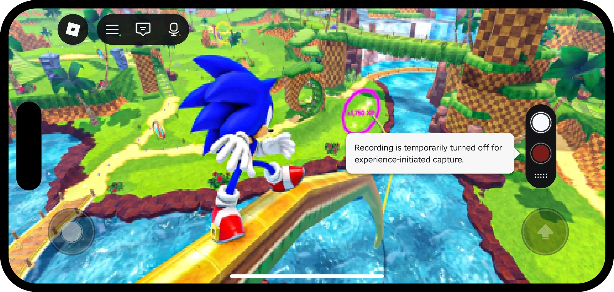
When capture is off
Both photo capture and video recording can be disabled when there’s a constraint, so we designed a turned-off look for the buttons, and a popover that gives the reason.